From Drab to Fab: Banner Creation for
MAXX Chemicals
Ever had that moment when you suddenly realize something's been right in front of you all this time, but you've just never noticed? That was us in the TCS showroom. We've been proudly serving the professional cleaning community for over 20 years. Over time, surrounded by the banners and marketing paraphernalia from the myriad of companies we represent, things started to blend into the background.
One day, amidst our regular routines, the boss had a moment of clarity. She pointed to an outdated banner of a product we no longer carried and remarked, "Isn’t it time we give this space a little refresh?" I had to agree; it was long overdue.
"Why not make a banner for our MAXX chemical line?" she mused. The MAXX chemical products, TCS's private label brand, has always been showcased (online, email promotions, etc.) even securing a prime spot right at the showroom's entrance. With the outdated banner tucked away at the showroom's rear, this was an ideal moment to rejuvenate a vacant space and shine a spotlight on a product line we are incredibly proud of.
My boss stated she wanted the banner designed at 3x6 feet, so with those dimensions known, I began the creation process. Navigating the intricacies of designing a banner isn't just about making something bigger; it's an entirely different ball game. Sure, I've got the 8.5x11 document game down pat. That's my bread and butter.
But jump to a 3x6 feet canvas, and you're venturing into a realm of considerations that you don't bump into with regular-sized printables. Image quality? Viewing distance? Glossy or matte? Grommets or not?
Trying to keep the integrity of the MAXX brand - the striking red logo, the subtle gray backdrop, and that unmistakable black footer – I aimed for clarity and elegance in the first draft. I envisioned a banner that was in line with our branding without overwhelming the viewer. Upon completing the draft, I sent it over to my boss, appending the message with the ever-so diplomatic, "let me know what you think." A gentle nudge to invite feedback, but also a subtle way of saying, "I'm open to revisions!"
Her feedback arrived promptly. "I love you but no," it began, signaling a need for revision. While the core branding elements were there, she wanted something with an added touch. A sprinkle of something unique, perhaps? Her feedback was clear, even if the exact direction wasn't: the design needed another round, a fresh perspective while staying true to MAXX.
So I open my Photoshop file, and start making more edits. At first I tried to make the light gray background darker (maybe the boss thought it was too "washed out" for the white wall it would have been placed on), but nothing resonated with me. And then it suddenly hit me - why not venture into the bold? Instead of going deeper into the grays, why not embrace the brand's signature red? It was a tad unconventional but I was indeed in the mood for trying something new.
I plunged into the red spectrum, tweaking and adjusting until I felt comfortable sending the next revision over and awaited feedback.
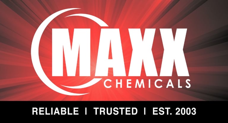

Her reply popped up sooner than I'd anticipated: "YES! This is much better." I couldn't help but raise an eyebrow in delight. The bold departure to a vivid red was not at all what I had envisioned. Yet, it seemed to strike the exact chord she'd been seeking, even if she hadn't realized it initially. Sometimes you don't truly know what you're after until it's right there in front of you.
While the new direction was clearly promising, she expressed a desire to explore a couple more variations. I chuckled to myself because, in the world of design, tweaks and revisions are practically part of the job description. I often joke about a "3 revision minimum" policy! Adjusting a detail here, fine-tuning a shade there – after all, it's those minute details that often make all the difference. The collaborative process, with its ebb and flow of ideas, is nothing short of a creative adventure.
And to that my friends, we come to the final design that eventually made its way to the showroom walls.
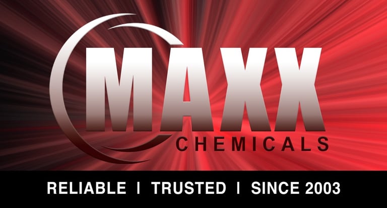

Embracing the bold backdrop, I decided the text could use a little flair as well. I added a gradient to give it a little modern touch. I did keep the black footer as it provided the perfect contrast for the white copy and kept it legible from a distance.
Now the once-overlooked space in the showroom now proudly flaunts the MAXX brand, transformed from a placeholder for another product to a vibrant display of our own line.
And as for those grommets? Yes, they made the cut.
rashondamiller.com
